Why we need plots in MATLAB? The human brain can process and respond to visual data better than any other type of data. The human brain processes image 60000 times faster than text and 90% of information transmitted to the brain is visual. People are using visuals to understand data easily. Effectively communicating data is challenging work. Graphs and plots can help us understand Complex data and even a new perspective.
According to Wikipedia, a plot is a graphical technique for representing a data set. Usually, a graph shows a relationship between two or more variables. Let’s see how we can use the plots in MATLAB.
Basic Line Plots in MATLAB
Vectors of the same length can be plotted against each other using the plot function.
Let us create a row vector. find more information on vectors and matrices here.
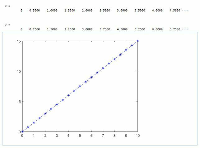
>> x = [0:0.5:10]
>> y = x*1.5
>> plot(x,y,”b--*)
This command plots a blue (b), dashed (-) line with an asterisk (*) as a marker.
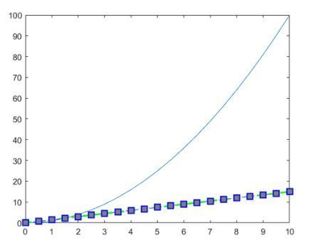
>> y1 = x^2
>> plot(x,y1)

Every plot command creates different plot figures. If we want to plot one line on top of another, then use ‘hold on’ command.
>> hold on
>> plot(x,y,”b--*”)

Plot function accepts additional arguments that allow us to change color, line style, marker style using different symbols. The line style, color, and marker can appear in any order.
Customization and Formating of Plots and Graphs
Symbols for different line styles are shown in the table below.
| Line Style | Description |
|---|---|
| - | Solid line |
| — | Dashed line |
| : | Dotted line |
| -. | Dash dot line |
The different markers available are shown in the table below.
| Marker | Description |
|---|---|
| o | Circle |
| + | Plus sign |
| * | Asterisk |
| . | Point |
| x | Cross |
| s | Square |
| d | Diamond |
| ^ | Upward pointing triangle |
| v | Downward pointing triangle |
| > | Right pointing triangle |
| < | Left pointing triangle |
| p | Pentagon |
| h | Hexagon |
The color description is shown in below table.
| Color | Description |
|---|---|
| y | Yellow |
| m | Magenta |
| c | Cyan |
| r | Red |
| g | Green |
| b | Blue |
| w | White |
| k | Black |
For custom colors, we can use an RGB triplet. An RGB triplet is a row vector with 3 elements specifying color intensity between range 0 to 1.
We can format the plot with additional formatting inputs like LineWidth, MarkerSize, MarkerEdgeColor, and MarkerFaceColor.
>> plot(x,y,"--gs", "LineWidth",2, "MarkerSize",10, "MarkerEdgeColor","b", "MarkerFaceColor", [0.5,0.5,0.5])
While the hold state is on, all plots continue to go on the same axes. To return to the default behavior, use ‘hold off’ command.
>> hold off.
Let’s plot a single vector by itself. v is a row vector with 6 elements.
>> v = [0.126 0.336 0.456 0.512 0.648 0.755]
Values of vector v go to the y-axis and set x-axis data to range from 1 to 6.

Cantilever Experiment Data Plotting
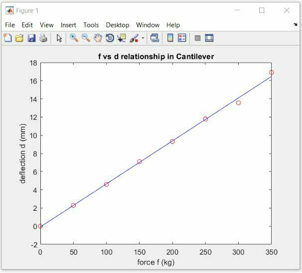
Here we have data collected from an experiment of cantilever deflection. Deflection d was produced in the beam by force f applied at one end while another end was connected to a rigid support.
| Force f (Kg) | Deflection d (mm) |
|---|---|
| 0 | 0 |
| 50 | 2.283 |
| 100 | 4.6 |
| 150 | 7.102 |
| 200 | 9.32 |
| 250 | 11.784 |
| 300 | 13.57 |
| 350 | 16.91 |
Find functional relationship between force f and deflection d. Let us first plot a graph.
>> plot(f,d)

This plot is a solid line joining the individual data points. These points can be shown using symbols like “o”, “+”, and “.”.
Let’s change the color to red, use a solid line and show data points using circles.
>> plot(f,d,”r-o”)
We can change the solid line with a dotted line.
>> plot(f,d,”r--o”)
Let’s suppress the connecting line and show only red circles.
>> plot(f,d,”ro”)

These dots are not on a perfectly straight line, but we can draw a straight line to show the linear relationship between f and d. Linear relations occur naturally in various natural phenomena. The linear function is drawn on paper, it becomes a straight line.
The least-square regression method is used to find a line that best fits the point on the plot.
Equation of straight line is
y = mx + c
y and x are coordinates of any point on the straight line. m is called slope which represents how steep the line is. c is the interception point of the straight line on the y axis.
Find m and c for the line that best fits the points on our plot
>> num = sum( d .* (f - mean(f) )
>> den = sum( (f-mean(f) ).^ 2)
>> m = num/den
>> c = mean(d) - m * mean (f)
Now find points on the straight line
>> line = m*f + c
Put the line on the plot.
>> plot(f,d,”ro, f, line, “b-”)
Now add labels to the plot.
>> title(“force to deflection relationship in cantilever”)
>> xlabel(“force f (kg)”)
>> ylabel(“Deflection d (mm)”)
Importing Data from Excel Sheets
Let’s see how can we import data from excel sheets. Double click on the excel file and MATLAB opens up a data import utility.
Unimportable cells are highlighted in yellow color and they will be replaced by NaN means not a number.
We can select the data we want to import. MATLAB automatically detects the table headings by looking at the first row. We can double-click on the column and change the table entry name. There is a drop-down below, through which we can change the data type of column elements. Then hit the import selection button and select import data. MATLAB creates a variable in the workspace which contains the data in form of a table.

Let’s plot a bar graph showing the population density of different states of India as present in the table.
>> states = categorical(PopulationData.Stateorunionterritory)
Categorical function creates an array that contains finite set of discrete categories.
>> bar(states, PopulationData.Density)

This bar graph shows that Delhi was the highest densely populated territory.
Lets plot a pie chart showing the national share of individual state and union territories.
>> pie(PopulationData.NationalShare)
Let’s add labels
>> pie(PopulationData.NationalShare, PopulationData.Stateorunionterritory)

Video Tutorial
Check the video below for quick practical tutorial.


